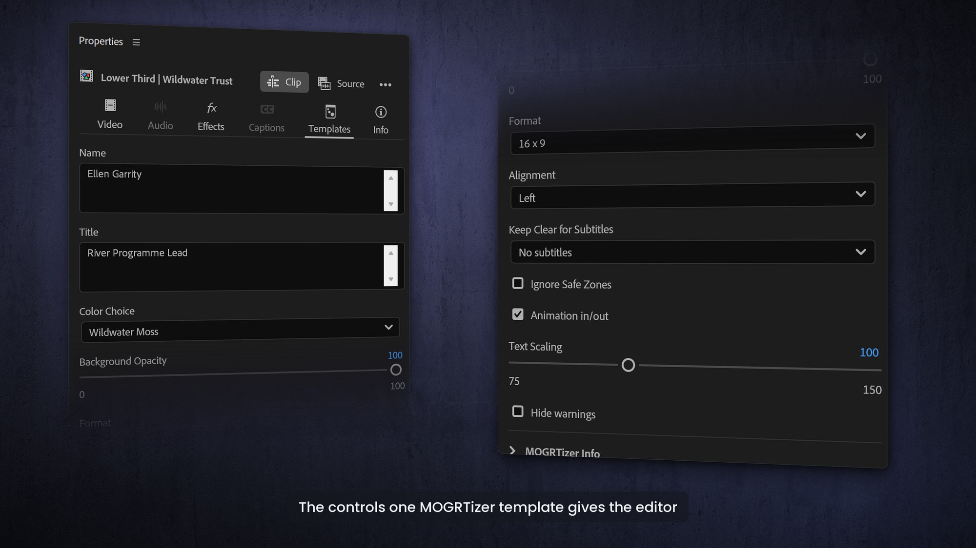
A good MOGRT is almost "idiot-proof". Once it is on the timeline it should be self-explanatory, with controls that make the right result easy to reach and the wrong result hard to stumble into. That is the whole craft of template design: not just making something animate, but making something other people cannot break.
The golden rule: no manual required
Beyond knowing how to put a template on the timeline, an editor should never need documentation to use it. That means clear, plain-language property names, a logical order, and controls that behave the way the name promises. If you find yourself wanting to write instructions, that is a sign the template design needs another pass.
Tie many settings to one control
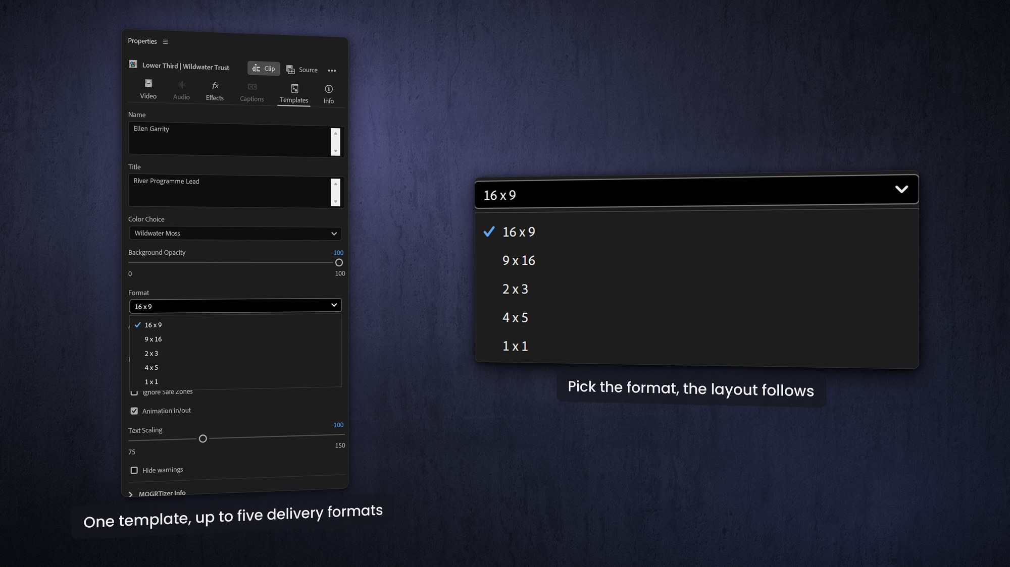
The most effective templates connect multiple changes to a single control. One dropdown can change a layout, swap a color set, and toggle a few layers all at once. The editor makes one decision; the template handles the consequences. Fewer controls, fewer clicks, fewer ways to get it wrong.
Use the right control for the job
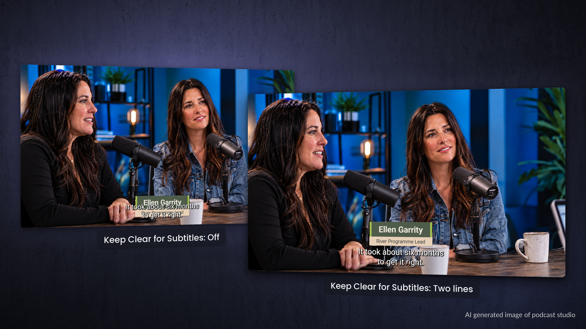
Match the control to the choice. Use dropdown menus for a finite set of options, like format, approved color combinations, or animation style. Use checkboxes for simple on or off states, like whether to leave room for one line of captions, two lines, or none, or whether to show a safe-zone overlay. Use sliders sparingly, for things that genuinely need a range. The goal is to constrain choice, not to offer a blank canvas.
Build in guardrails that protect the animation
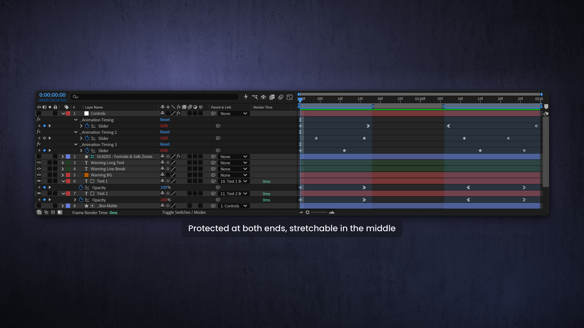
Guardrails are what separate a professional template from a fragile one. Protect your in and out animations (and any mid-clip logo move) with Responsive Design - Time, so editors can freely shorten or lengthen the clip without ever disturbing the timing of the animation. Lock colors and fonts to the brand so nobody can wander off-palette. And ship sensible defaults, so a template that has just been dropped on the timeline already looks right before anyone touches it. If 90% of the videos your team delivers are for social, the template should not default to 16:9 video.
Decide what is visible
Not every control deserves equal billing. Put the few things editors change most often at the top, and tuck the rest away.
Before you build, answer four questions:
- How will this be used, and how often?
- Who is it for, and what is their skill level?
- What options does it actually need, and what should the defaults be?
- And which controls should be the most visible and immediately available?
The answers shape a template that feels effortless.
Do not over-serve options
Too many options causes confusion. Every extra control is a small tax on the editor's attention and another chance to make a wrong choice. Clarity beats flexibility almost every time. There is a balancing act here, because more controls can also mean more layers and slower playback, so trimming options often makes a template both friendlier and faster.
Make it automation-ready
The best templates are also script-ready, so color and format choices can be automated from a panel in Premiere. When templates share the same building blocks and naming, an extension can adjust a property across a whole range of clips in one click. This is exactly what the MOGRTizer Batch Sync tool does: change the color, format, font or any other property, on every template in a sequence at once, with perfect, repeatable results.
Frequently asked questions
What makes a MOGRT user-friendly?
Clear labels, sensible defaults, the right control for each choice, and guardrails that prevent mistakes. If an editor needs a manual, it is not user-friendly yet.
How do I stop editors breaking the animation timing?
Use Responsive Design - Time to protect the in and out animations. Editors can then change the clip length without disturbing the keyframed timing.
How many controls should a MOGRT have?
As few as possible. Tie related changes to a single control, surface the most-used options first, and hide or remove the rest. Too many options causes confusion and can slow down the user.
What are good default settings for a MOGRT?
Defaults should produce a finished, on-brand result with no edits. A freshly dropped template should already look correct before anyone changes a thing.